Actively 'bad' translation is increasingly rare - at least in terms of accuracy of meaning.
When it comes to translation for offline print or online/interactive media, however, design, aesthetics and usability are key… and this means there is more to consider than just translating from A to B.
In such cases, the words are often fine. It's everything around them that can let the project down with significant cost, reputation and timing implications.
That's where DTP translation - multilingual desktop publishing - comes in.
DTP in translation is the process of taking translated text and making it work properly within the original design - whether that's a printed brochure, a software interface, a mobile game, an eLearning module or a digital ad.
DTP is a well-established term, but while 40 years ago it was mostly thought of in terms of print, typesetting and so on, the explosion of software, mobile apps and interactive media means there are now so many ways that translated content is surfaced in context with spatial, design and usability considerations.
Languages occupy space quite differently. German and Finnish, for instance, can run 30-50% longer than the same content in English, pushing text outside tables, buttons and interface elements if translated content is brute-forced into a format without thought.
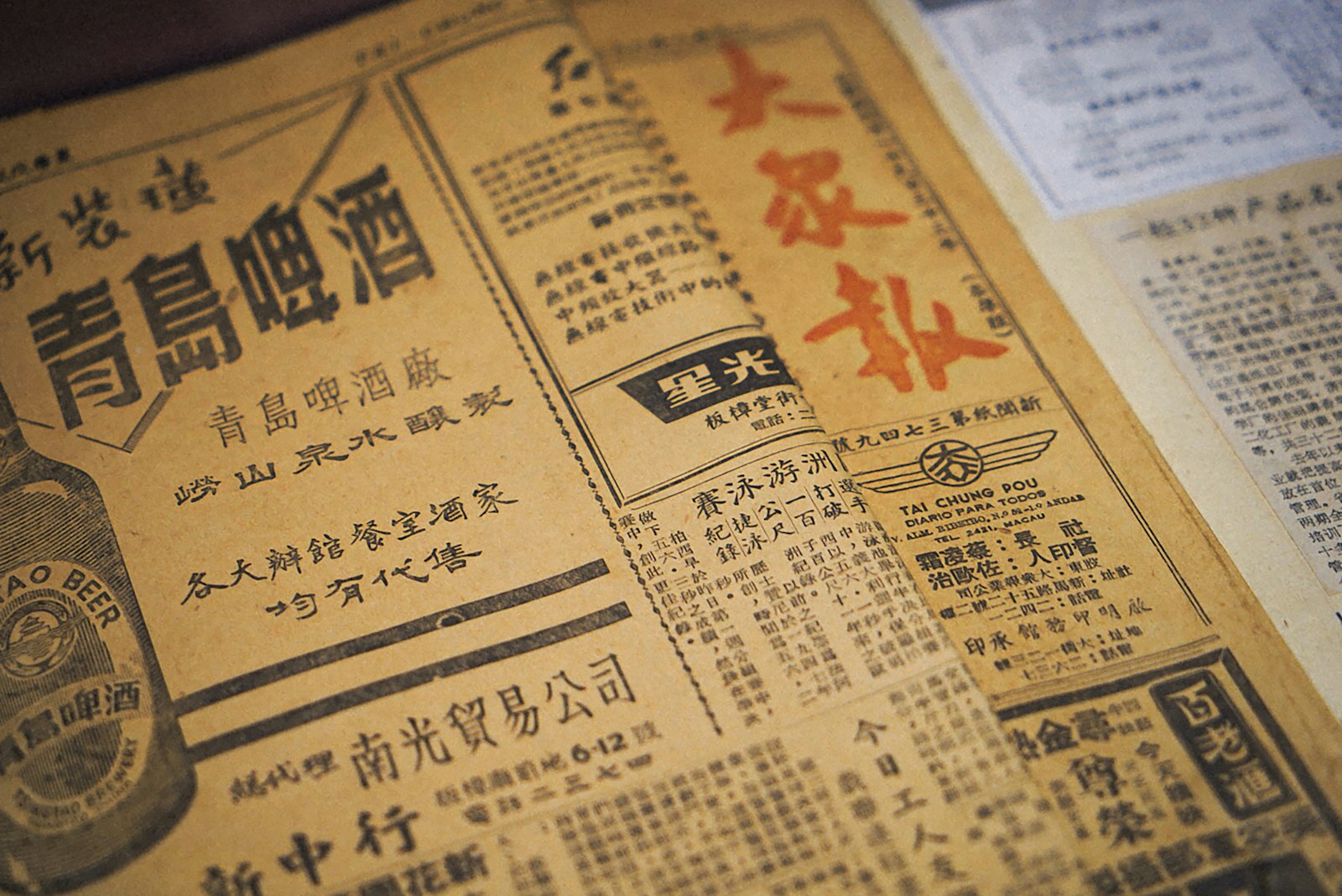
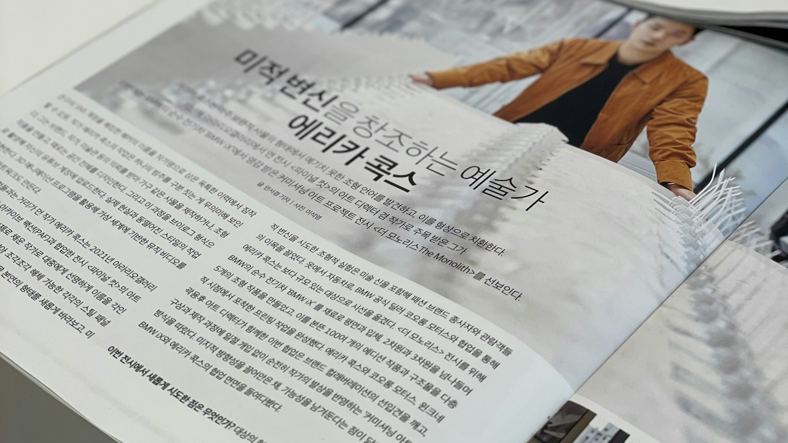
Arabic and Hebrew read right-to-left, meaning entire layouts may need to be mirrored. Chinese and Japanese can use considerably fewer characters to convey the same meaning, leaving awkward empty space if nobody adjusts for it.
The most stark differences and usability considerations only become visible - sometimes painfully so - once translated text goes back into the design layout.
I'm sure I'm not the only marketer who has seen premium print collateral - the kind that costs serious money to produce - arrive looking amateurish because the typesetting hasn't been adapted.
It is also something I (if I'm honest) get some fiendish enjoyment from if I spot a competitor at a big conference or expo and see that their translated print material, while presumably accurate, has come out looking like an inelegant block of text or a poorly spaced distraction.
One example that sticks in my mind from earlier this year comes from a tech event where a SaaS brand had invested in quite slick video brochures - the embedded-screen kind, not a cheap format.
The physical print elements looked contrastingly weird: some fonts too big, some too small. While this might not be a killer for a potential client who is already inclined to make a purchase, the overall impression wasn't commensurate with what they must have invested.
It feels wasteful to underperform at the final hurdle with this kind of thing - especially in a post-Covid world where physical media is being used to embody a brand and explain a concept. The best DTP really helps here. Poor first impressions still matter.
This is where DTP failures get genuinely expensive.
A short English UI label translated into Turkish or Afrikaans can easily double in length - and if the interface hasn't been built to accommodate that, you end up with truncated menus, overlapping controls or text that simply disappears.
This is where DTP should be raised as part of the process even if clients don't mention it - there are still too many translation agencies who will take on work, translate without a view to usability and then fold arms when the client isn't happy. It's incumbent on agencies to think on behalf of clients.
In mobile, PC and console gaming, the stakes are higher still. Titles going through age-rating processes - PEGI in Europe, ESRB in the US - must be submitted for certification before release.
If localisation and layout issues only surface after that submission, you're looking at rework, resubmission costs and, depending on how tight the release window is, a delayed launch. In competitive markets where release timing matters commercially, that's not a small risk.
A banner ad or Meta creative where the translated CTA is cut off, or where headline hierarchy is lost in localisation, performs worse - straightforwardly. With CPCs rising across so many niches, this is at least one aspect of performance that brands should be able to control.
That said, with so much AI-generated ad creative, it feels like some brands have taken a backward step, betting that more ad variants generated more quickly will outperform more carefully localised ads. I'm not ideological on this - the right approach will be evident in traffic and revenue - but there are real risks to accuracy of ad messaging, trustworthiness of design and conversion potential without good DTP.
This applies equally to Google Display, multilingual paid social and any localised ad creative for international markets.
At ICS-translate, we love working within Amazon marketplace. It is genuinely a whole search ecosystem that many SEO professionals fail to give full credit to, but every day we see the performance of correctly localised marketplace content.
Product images with embedded text, infographic panels, A+ content layouts - sellers expanding into European or Asian markets sometimes treat localisation as a text-only exercise.
All of it needs DTP attention to take full advantage of the Amazon shop window, and all of it affects conversion directly. While being present on Amazon and eBay opens you up to a world of customers, it is equally straightforward for competitors to do likewise - so establishing trust and earning that first click is key. DTP manifestly helps here.
For most SaaS and learning tech brands, a common challenge is engaging learners who don't particularly want to learn - mandatory training, policy modules, disciplinary content and the like. With not-so-engaged learners, an efficient interface is especially important.
Instructional design relies on visual hierarchy. Where things sit on screen matters as much as what they say. A localised module where text overflows caption boxes, or where a diagram label runs into an image, can undermine comprehension - which rather defeats the point of the exercise and the goal of learning.
Outcome-focused DTP that understands the context in which users interact with localised content is key, and that includes the emotional context. If learners are bored or resentful, the DTP and translated content should at least not make a disengaged person more disengaged. Translation agencies don't always talk about such practicalities, but it's fundamental to getting the right results and tackling risks (and opportunities!) head on.
In Part 2 of this blog, we cover how AI is changing the DTP picture, what regulated sectors need to think about, what a strong DTP workflow actually looks like in 2026 - and what to ask a prospective agency before you brief them.